Visual Options
<< Editor Options | IBExpert | Keyboard Templates >>
Visual Options can be found in the IBExpert Options menu. It opens the Visual Options Editor, which enables users to customize the IBExpert interface. It is possible, for example, to specify the behavior of pop-up menus, the appearance of border and button styles, and even of splitters.
Bars and Pop-up Menus
The first tab in the Visual Options Editor is the Bars and Pop-up Menus page, which offers the following options:
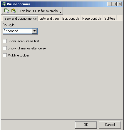
- Bar Style: the options Standard, Enhanced or Flat may be selected. The visual effects of the selection is immediately visible in the sample toolbar, displayed at the top of the Visual Options window.
- Show recent items first: reduces those menu items offered in the pull-down list, to those most recently selected by the user.
- Show full menus after delay: if one of the most recent menu items is not immediately selected, the full range of menu items is displayed.
- Multiline toolbars: allows toolbars to cover more than a single row (which may eventually lead to icons running off the right-hand side of the screen, if too many toolbars are active).
Lists and Trees
The Lists and Trees page offers the following options:
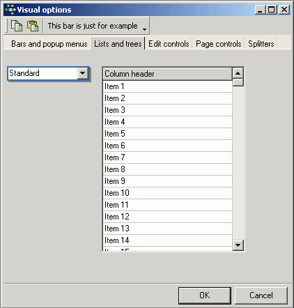
Lists and trees may be displayed in a Standard, Flat or Ultraflat format. The visual effects of the selection can immediately be seen in the example field grid, displayed to the right of the pull-down list.
Edit Controls
The third page in the Visual Options Editor is the Edit Controls page, which offers the following options:
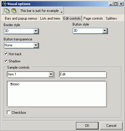
- Border Style: options offered include None, Single, Thick, Flat and 3D. The visual effects of the selection is immediately visible in the sample controls panel in the lower area of the window.
- Button Style: the options offered here include Default, 3D, Flat Simple, HotFlat. This changes the style of displaying application buttons. The effect can be previewed in the sample controls (observe the combo box and check box).
- Button Transparence: here the options include None, Inactive, Always and Hide and Inactive. This alters the appearance of transparent buttons. The effects can be viewed in the sample controls (observe the combo box).
- Hot Track: activating this option causes boxes and buttons to be highlighted with a 3D effect, when the mouse is focused over it. The effect only be previewed on all sample controls, if the Border Style None has been selected. Otherwise this effect can only be observed on the combo box.
- Shadow: this option places a shadow effect around boxes. The sample controls preview shows the effect of this.
The sample controls panel displays a preview of how a drop-down list (combo box), edit field, memo panel/window and check box appear, as specified by the user.
Page Controls
You can customize the Page Control component look here:
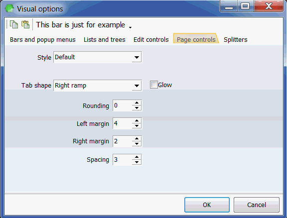
The effect of any changes you make can be seen immediately in the Visual Options window. Any alterations made take effect on the rest of your IBExpert workspace, once you have saved them. The following options can be modified, to adjust the appearance of your IBExpert pages:
- Style: Here a range of styles are offered to customize the style of your IBExpert pages:
- Tab shape: here you can select from rectangle, left ramp, right ramp and left and right ramp. Activating the Glow checkbox alters the appearance of a selected tab.
- Rounding, Left margin, Right margin, Spacing: these options adjust the appearance and spacing of all tabs.
If you are still working with an IBExpert version older than 2011.12.01, the Page Controls page offers the following options:
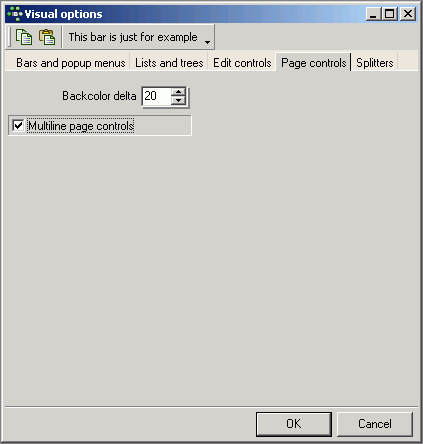
- Backcolor delta: this option alters the contrast shade of those page tabs currently in the background. The default value is 20; any changes to this value can be previewed immediately by observing the Visual Options Editor's own page tabs.
- Multiline page controls: when checked, this option allows page tabs (or page controls) to be placed over more than one line. This saves the user the necessity of sliding from left to right in order to find the page he needs. The effect of this option can most easily be viewed in the DB Explorer. Usually the DB Explorer width is limited, in order to allow sufficient space in the main working window. It is therefore often the case that only a small number of the DB Explorer page tabs are visible, and it is necessary to move from left to right before opening, for example, the Windows page. Using this option, the page tabs are displayed over two rows, enabling the user to simply click on the page he needs.
Splitters
A splitter is a moveable line, dividing a child window or editor into two panels.
The Splitters page enables the user to specify the appearance of all IBExpert splitters:
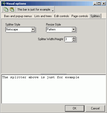
Available options include the following:
- Splitter Style: the options offered here include Standard and Netscape. The Netscape style includes a centered strip (if the splitter width is sufficient, directional arrows are visible). The user simply needs to click on this strip to move the splitter up or down (or left or right if the splitter is vertical), thereby reducing the size of one panel or window and simultaneously increasing the size of the second panel or window. It is also possible to manually adjust the splitter position using drag 'n' drop. When using the standard style the only way to move the splitter is by using drag 'n' drop.
- Resize Style: the options offered here include None, Line, Update and Pattern. The effects of these options can be viewed by dragging and dropping the sample splitter.
- Splitter Width/Height: the effects of any alterations here can be viewed immediately on the sample splitter, displayed in the lower half of this page.
back to top of page
<< Editor Options | IBExpert | Keyboard Templates >>


